
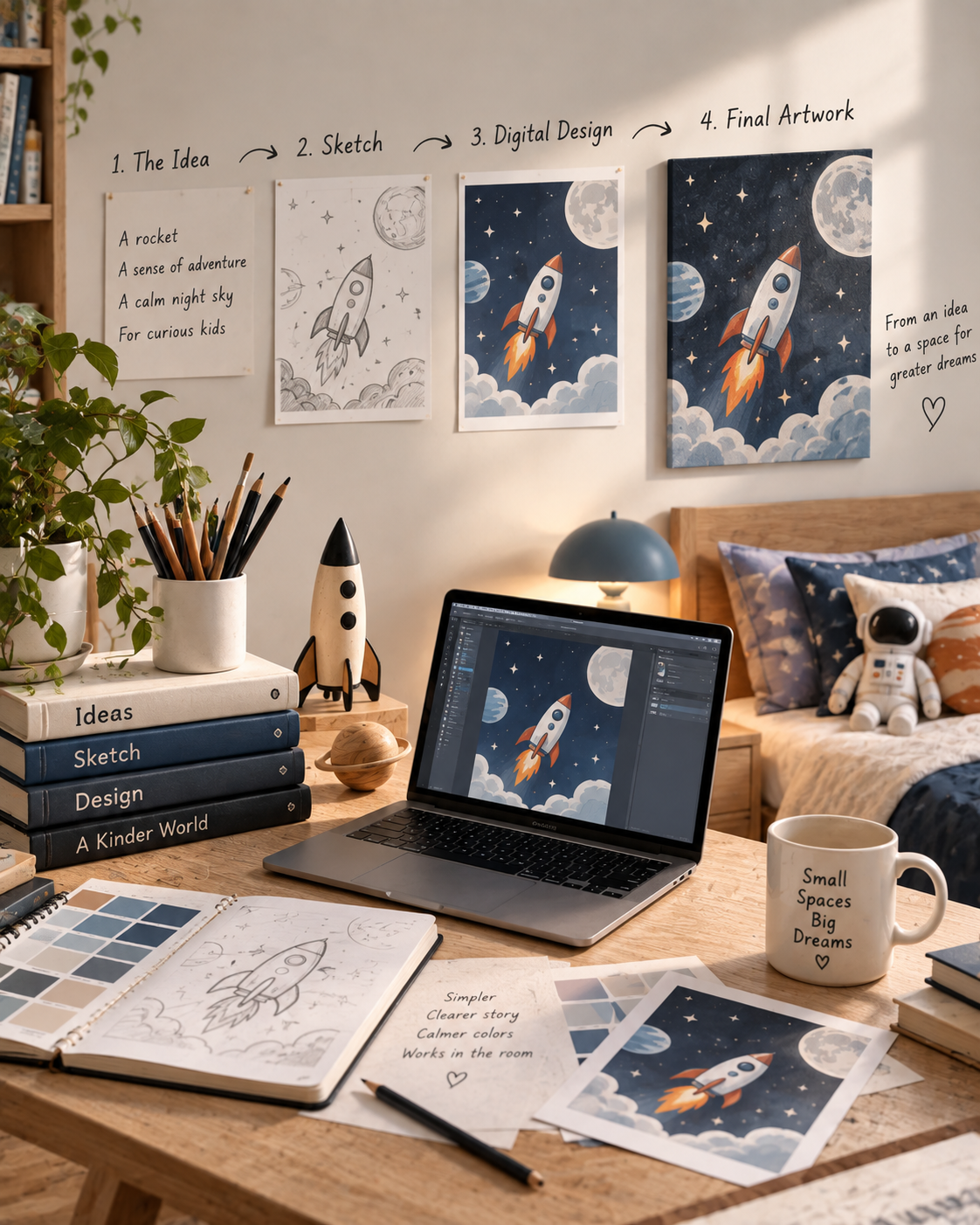
Every piece of wall art begins before there is a finished illustration, a product mockup, or a place for it in the shop. It begins with an idea about a room.
At North & Nook, we rarely start by asking what image would look good on a wall. We start by thinking about the feeling we want the room to have. Is it playful? Quiet? Curious? Adventurous? Is the artwork meant for a younger child who is just beginning to discover a theme, or for an older child who may want something with a little more depth?
Those early questions shape everything that comes after.
A space design, for example, could begin with something as simple as a rocket. But a rocket on its own is not yet a finished idea. We still need to decide whether the piece should feel playful or cinematic, whether the background should be light or dark, whether the composition should feel energetic or calm, and how much visual detail the room can comfortably carry.
The artwork grows from those decisions.
Once the direction is clear, we begin building the composition around one main idea. We try to avoid filling the piece simply because there is empty space available. Instead, we decide what should attract attention first and what should quietly support it. A moon, a planet, a landscape, or a few stars might be enough to complete the story without making the image feel crowded.
This is the stage where subtraction becomes just as important as addition.
Sometimes a design improves because another object is added. Sometimes it improves because three are removed.
We pay close attention to the balance between illustrated areas and open areas because the artwork will eventually have to live inside a real room. A composition that feels perfectly full on a screen can become overwhelming once it is placed above a bed, beside a lamp, near books, toys, and patterned bedding.
So even while the artwork is still taking shape, we are already imagining the room around it.
Color is refined in the same way. We look for combinations that give the artwork personality without forcing the entire room to follow one rigid palette. Strong colors can be useful, but they usually work best when balanced by quieter tones. The aim is to create something that can sit naturally beside wood furniture, neutral walls, soft bedding, or other objects that were never designed to match it perfectly.
That flexibility matters because children’s rooms are not static.
They change.
A favorite toy appears. A new blanket arrives. Books multiply. Interests shift. A child who once wanted rockets everywhere may later become more interested in planets, astronomy, or something completely different.
We want the artwork to have enough character to feel meaningful, but enough restraint to remain comfortable as the room evolves.
Once the illustration itself feels resolved, the next challenge is making sure it works as a physical product.
This is where size and proportion become critical.
The same artwork may need to work across several canvas sizes, and those sizes are not always identical in shape. A composition that looks good in one format may lose an important detail in another if the artwork is not prepared carefully.
So we think about safe areas, cropping, spacing, and the position of the main subject before the final product is created. Important elements should not sit too close to edges where they may be lost or wrapped around the side of a canvas.
This part of the process is less visible, but it matters a great deal.
A finished image is not truly finished if it only works at one size.
The artwork needs to survive the transition from a digital composition to something that will exist at a real physical scale.
That also changes the way we prepare product images.
When a canvas is shown above a bed, its size should make sense relative to the furniture. A small canvas should not suddenly appear enormous just because a dramatic mockup looks more impressive. A large piece should not be reduced until it looks like a small poster.
The room should help people understand the product, not distort it.
For us, this is an important part of the design process because presentation affects expectation. The finished product should feel consistent with what someone saw when they chose it.
That means we think carefully about room scale, orientation, spacing above furniture, and the relationship between the artwork and the objects around it.
We also try to keep the room itself quiet enough for the art to be understood.
A mockup filled with too many decorative objects may look stylish, but it can make it harder to see what is actually being offered. When possible, we prefer simple furniture, a clear wall, a small lamp, and only a few objects that help establish scale and atmosphere.
The artwork should remain the reason the image exists.
By the time a piece reaches the shop, many of these decisions are no longer visible.
Someone sees the finished artwork, chooses a size, and imagines how it might look in their child’s room. They do not necessarily see the versions that were simplified, the colors that were adjusted, the elements that were moved away from an edge, or the mockups that were rejected because the scale felt wrong.
That is part of the process.
Good design often hides the work that went into making it feel simple.
For North & Nook, a finished piece of wall art is not just an illustration placed on a product. It is the result of thinking about the image, the physical object, and the room as one connected system.
The idea begins with a feeling.
The design gives that feeling a visual form.
The product gives it a physical scale.
And the room gives it a place to belong.
That is when the piece finally feels finished.